Table of Contents
Who says that creativity and science can't be together? When it's about colors in art, they work closely. That's what color theory is all about.
We use color theory in our daily choices. In clothing, business, and what we buy. When you do art, like a painting, design, photo, or video, color is a big choice. It's really important for the message and how it looks. If you don't use color theory, your video won't look good.
Color theory helps with color ideas, combos, making things match, and showing different feelings. For a brand, color theory is important to show what you stand for and connect with people. For years, marketers have used color theory to make people feel or acta certain way.
It's not just about picking a favorite color or matching your logo. It's about knowing colors. So, it's smart to learn about color theory and the color wheel.
What is Color Theory?
In easy words, color theory is how designers, artists, and people who make stuff communicate using colors. They use a color wheel, like the one below. This wheel has all the main colors you need, even ones you might not have heard of. Knowing these colors, how they mix, and how they make feelings is super important.
People use color theory to make art. It's also in ads, TV, movies, posters, and lots of other things. Designers use it to make people feel a certain way, think about culture, how our eyes work, and more.
What are The Basics of Color Theory?
The Color Wheel
The color wheel is super important. It’s represented by a 360° circle, and you might have seen it when you changed a picture or video. Depending on what you're making, there's a different way to mix colors. They have main colors that you can't mix from others, colors that come when you mix main colors, and colors from mixing main and other colors.
There are three main ways to mix colors. They are:
- RGB, which stands for red, green, and blue. These are the main colors for light. Other colors in this system are yellow, cyan, and magenta. There are more colors like orange, chartreuse, and so on. This system is for screens like TVs and computers. If you're using apps like Photoshop or Premiere Pro, use RGB.
- CMY, which means cyan, magenta, and yellow are main colors. Other colors here are red, green, and blue, like RGB. The extra colors are the same as RGB's extra colors. This is for printing with ink. Sometimes black is used too, which is called 'key'. This is known as CMYK.
- RYB, which is red, yellow, and blue as main colors. For other colors, you've got orange, green, and purple. There are more colors like vermillion, amber, and so on. Painters and artists use RYB to mix colors.
Color Hue
Hue means 'color.' Simple as that. Imagine a color wheel – each spot on it is a different hue. You can try out different hues in photo and video editing apps. Just change the number for the hue you want.
Color Value
This is about brightness, from really light to really dark, like from white to black. When you adjust the color setting, your color can look completely different. Sometimes, people call this 'luminance.'
Color Saturation
This is about how powerful your colors are. Colors with low saturation have less color and look weaker. Colors with high saturation are vibrant and full of color. Just like color hue and brightness, you can change saturation using the color wheel in many modern editing programs.
Color Tint
This is about adding a touch of white to a color. For instance, if you add white to red, you'll get pink.
Also read: Get to Know 7 Basic Camera Movement Used in Video Production
Color Shade
Shade is like the opposite of tint. You mix in some black. If you shade red, you'll get burgundy.
Color Tone
Toning happens when you mix black and white with a color. This makes the color darker and softer, and it lowers the contrast and intensity.
Warm and Cool Colors
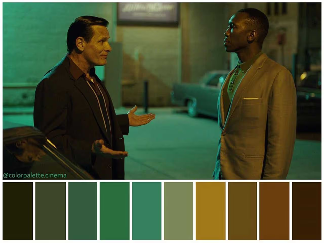
This terminology might seem a little fluffy, but it’s crucial you know the difference between warm and cool colors. They help determine the mood of your content. John Carpenter’s classic movie ‘The Thing’ wouldn’t work if everything were sunkissed orange; everything is white, blue and black, to match the harsh environment.
You can separate the warmand cool colors by splitting the color wheel in half. Yellow, oranges and reds are warm, whereas greens, blues and purples are cool.
How to Use Color Theory?

Now that you understand color theory and color wheels, let's use it. Here are some color ideas to make unique and creative stuff. Since you'll probably use a computer, these tips are based on the RGB color mixing model.
- Monochromatic: Choose one color, then use different shades and tints of it for other parts.
- Analogous: Use three colors next to each other on the color wheel. To change things up, mix in some white to make a 'high-key' version.
- Complementary: Pick two colors from opposite sides of the wheel to make a strong difference.
- Split-Complementary: This is also called 'Compound Harmony.' Add colors from beside your complementary pair to make the contrast softer.
- Triadic: Take three colors evenly spaced on the wheel – like one at 40°, another at 80°, and a third at 120°. It might not look super bright at first, but there's contrast between the starting and ending points. Using a range of colors like this helps make nice designs.
- Tetradic: Choose four colors, but not any colors. Pick two pairs of complementary colors and make one color stand out.This is good for designs with a strong theme, but be careful with balancing warm and cool colors.
- Square: This mixes triadic and tetradic. Pick four colors spaced evenly on the wheel.
What Do Colors Mean?
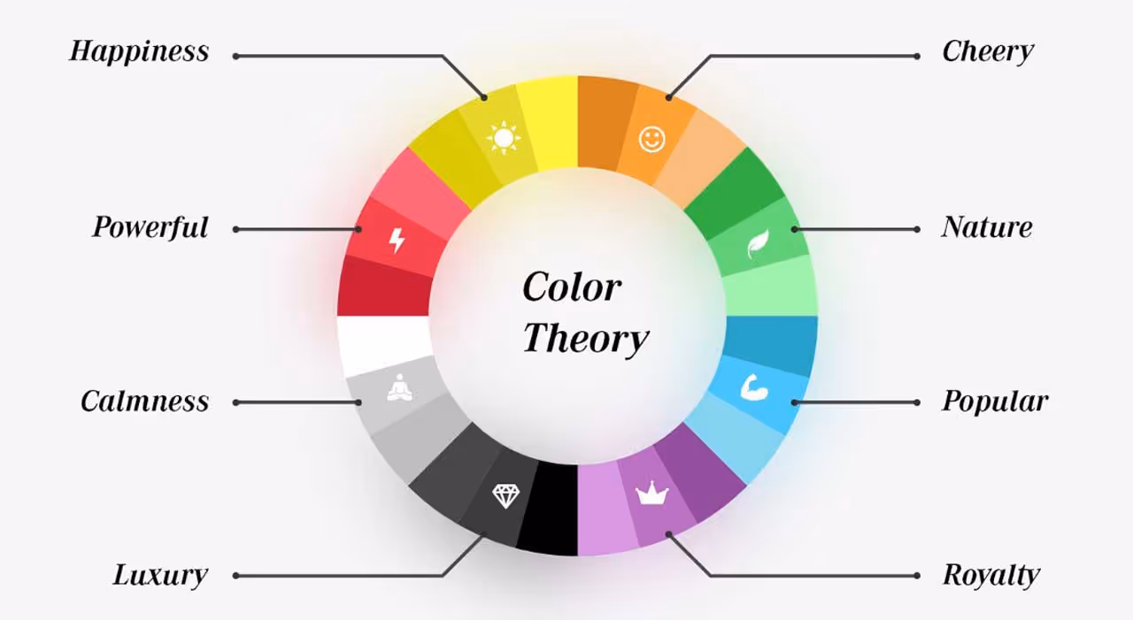
You can use color theory to show feelings without saying anything. Here's a simple guide!
- Red: Love, blood, fire, strength, power, energy.
- Purple: Power, money, wanting more, being special.
- Blue: Trust, water, sky, calmness, deepness, peace.
- Green: Freshness, nature, getting bigger, safety, money.
- Yellow: Energy, sunlight, happiness, being happy, joy.
- Orange: Warmth, fall, feeling good, success, creativity.
You can also take away all the color and just have black and white, like in the old days.
Why Should You Learn Color Theory?
Color theory helps you know how colors work together and how our eyes see them. When you know this, you can use colors well. You can understand what makes people feel certain ways, change the lighting, put colors in the scene, use strong differences between light and dark to show feelings – there are so many things you can do.
No matter if you're into movies, TV, photos, design, or anything else, using color theory right will make your work better.


.svg)